A North Shore homeowner can hold a colour card against the wall in the morning and feel confident, then see an entirely different result by evening. Coastal brightness, window direction, surrounding greenery, timber floors, existing furnishings, wall condition and paint sheen all change how a colour reads. A warm white can look creamy in one room, clean in another and unexpectedly yellow beside cool lighting.
That's why the best painting interior walls color ideas start with the room, not the swatch. North-facing and west-facing rooms can receive strong natural light, while shaded hallways, older villas and apartments may need colours that retain warmth without becoming dull. A smooth, well-primed wall will also show a colour more evenly than a surface with patched holes, stains or visible roller texture.
The ten directions below cover adaptable foundations, light-sensitive rooms, calming colours, feature walls and architectural accents. They're suitable for heritage villas in Devonport, apartments in Takapuna, new builds around Albany and commercial interiors across the North Shore. Use the examples as starting points, then test the actual paint on your walls before committing.
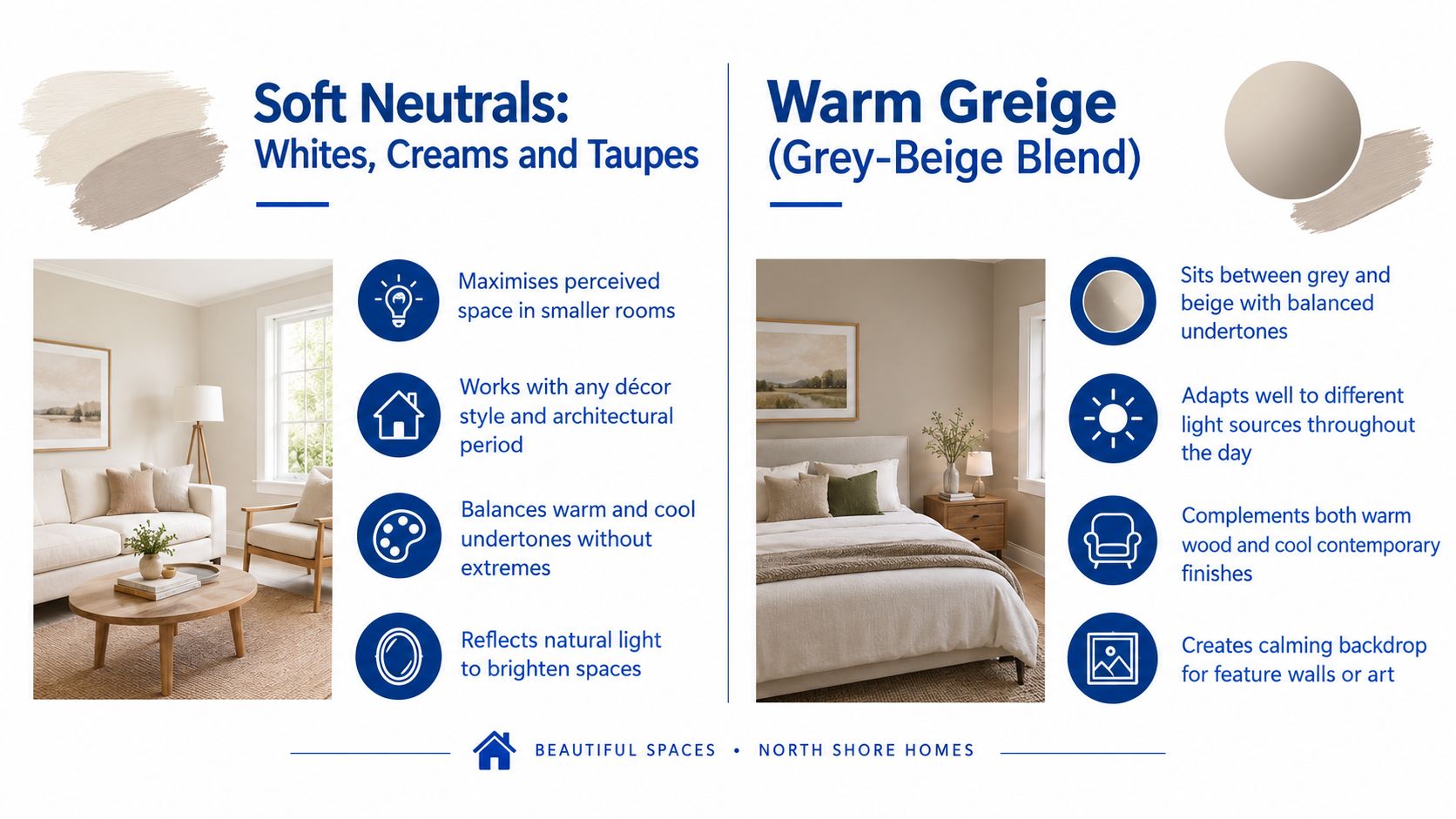
1. Soft Neutrals, Whites, Creams and Taupes
Soft whites, creams and taupes remain dependable because they work with changing furniture, timber, stone and natural light. New Zealand interiors have traditionally favoured restrained tones. A New Zealand homebuilder's colour guidance identifies whites, creams, greens, greys and browns as popular choices in new homes, reflecting a long-running preference for calm, adaptable schemes.
For a North Shore villa, Resene Alabaster can provide a warm, period-friendly base without making the interior feel dated. In a contemporary open-plan build, Dulux Natural Calico can create continuity between the kitchen, living area and hallway. Resene Warm Grey and Dulux Refined Taupe are useful alternatives when a pure white feels too stark or a beige feels too traditional. These colours also suit offices and managed properties where broad appeal matters.
Make a neutral room look intentional
Neutral doesn't mean every surface should be identical. Use a slightly deeper greige on one wall, warm white on the ceiling and a soft off-white on trim to create quiet contrast. In kitchens and bathrooms, satin or semi-gloss can improve cleanability, while low-sheen or satin walls usually give living areas more depth than a completely flat finish.
Test samples in morning, afternoon and evening light. If the existing walls are marked, chalky or strongly coloured, washing, filling, sanding and priming matter as much as the chosen shade. A suitable Resene or Dulux primer-undercoat can reduce uneven absorption, and a tinted undercoat may help a new colour cover consistently.
Practical rule: A neutral should support the room's fixed features. Check it beside the flooring, benchtop, cabinetry and window coverings before you judge the paint alone.
For more guidance on choosing a light foundation, review these white wall paint options. The right neutral can make a small room feel more open, but only when the undertone works with the light already available.
2. Warm Greige, Grey-Beige Blends
Warm greige sits between grey and beige, which makes it useful when a room needs contemporary softness without the coldness of blue-based grey. It can connect existing grey flooring or stone with warmer timber, brass and linen. In a North Shore home, that flexibility is valuable because adjacent rooms often receive different amounts of daylight.
Resene Timeless is a practical starting point for open-plan living areas where one colour needs to flow through several zones. Dulux Sophisticated Taupe can suit a more established home, a commercial office or a residential repaint where a stronger neutral is needed. Greige also works behind a feature colour because it provides enough contrast for muted blue, sage, terracotta or charcoal without competing with it.
Control the undertone before painting
A small colour card won't show how greige behaves across a large wall. Paint large sample boards, move them between the main window wall and the opposite wall, and view them in morning, midday and evening conditions. If the room has cool LED lighting, a greige with a subtle red or yellow undertone may feel warmer than expected. If the room already has orange timber, choose carefully so the combined effect doesn't become muddy.
Preparation remains visible with low-sheen finishes. Fill dents, feather the edges of repairs and remove dust before applying the selected system. Satin or low-sheen paint adds a gentle surface response, but it can also reveal ridges and patchiness that a poorly prepared wall would hide under a flatter coating.
Natural timber helps greige feel residential rather than corporate. Warm metallics, woven fabrics and soft blue accessories can also stop the palette from becoming lifeless. Use this North Shore interior colour scheme guidance when you need the same undertone to work across several rooms.
3. Deep Navy and Charcoal Accent Walls
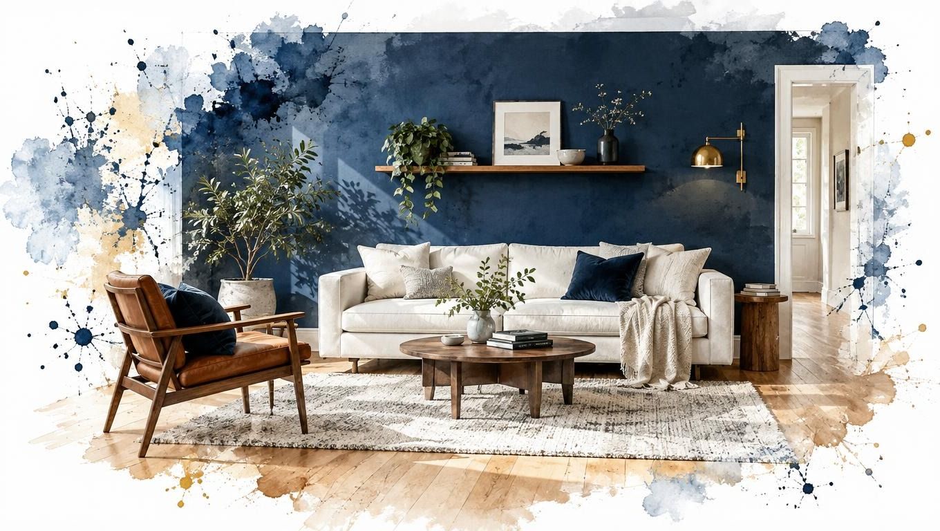
A deep navy or charcoal wall can give a plain room a strong focal point without repainting the entire home in a dark colour. Resene Dark Slate could anchor a bedroom behind the bed, while Dulux Classic Navy can create definition at the end of an apartment hallway. In a North Shore office, charcoal may add authority to a boardroom, but it needs careful lighting and a clean background.
Keep the dark colour to one deliberate wall or zone in most homes. The wall opposite the main entry, the wall behind a bed or the wall containing a fireplace usually makes more sense than a narrow wall interrupted by doors and windows. White or cream ceilings and trim protect the room from feeling enclosed.
Dark colour needs a clean surface
Dark coatings make dents, roller marks and uneven sheen easier to notice. Sand filled repairs until the edges disappear, spot-prime exposed areas and use a high-opacity interior product suited to the colour. Don't assume a dark topcoat will conceal poor preparation. It often does the opposite.
Leave a large sample in place for several days and view it with the curtains open, the curtains closed and the room's evening lights on. Strong natural light can make navy feel clearer and more blue, while low light can push it towards charcoal. Add a wall sconce, reading lamp or directional accent light where the room needs practical illumination.
Dark paint works best when the furniture and lighting are already doing some of the visual work.
Pair navy or charcoal with cream upholstery, pale timber or warm white trim. If you want to bring in wood or tile beside the colour, this guide to an accent wall with wood or tile offers a useful complementary direction. See more interior feature wall ideas before deciding whether the wall should be painted, lined or given another finish.
4. Soft Sage and Muted Greens
Soft sage, eucalyptus and greyed greens bring a natural quality to bedrooms, ensuites and quiet living spaces. Resene Pale Leaf works with pale timber and white joinery, while Dulux Soft Sage suits a restrained Scandi-inspired scheme. Their lower saturation adds personality without dictating every furnishing choice.
North Shore light changes the balance. A room facing a leafy garden can make muted green look stronger, while cool artificial light may push sage towards grey. Paint a large sample beside the skirting, flooring and cabinetry, then check it in daylight and under every lamp used after dark. For pairing sage walls with timber floors, use the Buff & Coat Hardwood Floor Refinishing guide to review undertone coordination before committing.
Keep green restful rather than medicinal
The calm effect depends on an even base. Remove marks and residue, fill old picture-hook holes, sand rough repairs and prime exposed areas. Consistent preparation helps the colour remain uniform across old plasterboard, repaired plaster and previously painted walls. Apply the paint in manageable sections, keeping a wet edge so joins do not become visible as the surface dries.
Warm timber, brass, rattan and natural linen keep sage from feeling cold. Cream or off-white ceilings retain brightness in a bedroom with limited direct sun. Choose a low-sheen or satin wall finish for subtle depth, then use a more washable product in a bathroom or high-contact area within the manufacturer's system. Sheen changes how strongly daylight reflects from the wall, so test the finish as well as the colour.
A sage feature wall can suit a wellness studio or meditation room, while an all-wall application often works better in a bedroom or smaller retreat than in a busy open-plan area. Keep adjacent trim and ceilings warm enough to support the green. The finished room should feel controlled, softened and connected to its existing materials.

5. Warm Terracotta and Earthy Ochres
Terracotta, clay and ochre create a grounded backdrop for rooms where people gather. Resene Warm Sand can bring gentle earthiness to a villa dining room, while a Dulux Warm Terracotta feature wall can define a kitchen and dining zone. Similar tones can suit cafés and hospitality interiors, particularly where timber, ceramic surfaces and warm lighting already set the mood.
These colours need more planning than a neutral because they reflect warmth back into the room. In a bright dining area, that can feel welcoming. In a small room with little daylight, the same colour may feel heavy if used on every wall. A feature wall, dining alcove or lower zone often gives the effect without reducing the visual space.
Match the colour to how the room is used
Terracotta generally works best in dining rooms, kitchens, lounges and entertaining areas. It can feel out of place in a room that needs a crisp, quiet atmosphere, such as a compact study with cool overhead lighting. Pair it with cream or pale trim rather than stark blue-white, which can make the wall appear more orange by comparison.
The surface needs to be smooth because earthy colours show variations in roller loading and patch absorption. Repair dents, seal porous areas and keep a wet edge while rolling so adjoining sections don't dry with visible overlaps. Satin or low-sheen finishes can give the colour a considered appearance, but higher sheen will reflect more light and expose more surface irregularity.
Brass, copper, natural timber, linen and woven textures reinforce the palette. If the room is small, use the terracotta behind a dining table or fireplace and keep the remaining walls warm white or soft greige. That creates a clear focal point without turning the entire room into a colour statement.

6. Soft Blush and Dusty Rose Tones
Blush and dusty rose can add warmth without the sugary appearance associated with bright pink. Resene Elegant Rose may suit a powder room or main bedroom, while Dulux Dusty Rose can create a restrained feature wall in a contemporary family home. In a Devonport or Takapuna renovation, a muted rose can also soften white cabinetry and pale stone.
Light changes this family of colours quickly. A blush can appear pink in one part of the room, peach in warm evening light and greyed down beside a cool window. Test it next to the trim and furnishings, then observe it at different times before ordering enough paint. The colour needs to work with the room's fixed elements, not just look attractive on a sample card.
Balance the warmth
Warm white, cream and greige trims usually complement dusty rose better than a sharp cool white. That combination produces a coherent transition between wall and woodwork. If the room begins to feel too warm, introduce blue-grey through artwork, bedding or occasional furniture rather than switching immediately to a colder wall colour.
A low-sheen or satin finish can give blush a gentle richness, but it won't compensate for poor preparation. Fill and sand old holes, remove grease in kitchens or powder rooms and prime repaired areas so the final colour doesn't flash across the wall. Where moisture or frequent wiping is expected, choose a suitable washable system and finish rather than relying on colour alone.
Dusty rose is more versatile than many homeowners expect, but it still works best when used deliberately. It can make a bedroom feel settled, give a powder room character or warm a reading nook. It may be less suitable as the dominant colour through a whole house where future furniture and resale neutrality are priorities.
7. Muted Powder Blue and Soft Periwinkle
Powder blue, periwinkle and soft slate blue suit bedrooms, bathrooms and guest rooms that need a calm, clear atmosphere. Resene Powder Blue can work with white ceilings and pale timber, while Dulux Soft Periwinkle offers a slightly more colourful direction for a bathroom renovation. A muted blue feature wall can also give a Takapuna or Devonport guest bedroom a distinct identity without overwhelming the room.
The key word is muted. Very bright blue can feel artificial or nursery-like, especially beside cool white joinery. Greyed blue has more flexibility and can connect with brushed metal, natural stone, warm timber and soft neutral fabrics.
Read blue against the room's light
North Shore rooms don't all receive the same daylight. A bright room may benefit from cooler colour because it can temper glare, while a shaded room may need a blue with enough warmth to avoid looking icy. Dulux's guidance on choosing the right paint colour specifically addresses the way cooler colours can help balance abundant natural light, including in north- and west-facing spaces.
Paint samples on more than one wall, then check the colour at bedtime and under bathroom lighting. Use cream or warm white on the ceiling when the blue feels too sharp, and add warm timber or brass to keep the room from appearing clinical. Low-sheen or satin finishes provide slight depth without the glare of gloss.
Blue also highlights inconsistent filling and sanding when light travels across the wall. Prepare the surface carefully, especially around windows and doors where side light makes defects more obvious. A calm colour won't look calm if the substrate is visibly uneven.
8. Rich Emerald and Deep Forest Greens
Emerald and deep forest green create drama for a study, bedroom or selected feature zone. Resene Deep Forest can frame a bed or built-in joinery, while Dulux Emerald Green may suit a home office where the colour needs more presence. These shades can also work in hospitality or wellness settings, particularly alongside plants, timber and textured fabrics.
Use them with restraint. One wall behind a desk, bed or fireplace usually gives the strongest result. Painting every wall in a small, poorly lit room can make the space feel compressed, and a large open-plan area may lose visual separation if the green spreads beyond the intended zone.
Build the feature around light
A dark green needs either good natural light or a lighting plan. Add a reading light, wall sconce or directed artwork lighting where the wall would otherwise become a dark block after sunset. Cream or warm white trim helps retain contrast, while pale timber can keep the scheme connected to the rest of the home.
Dark colours expose surface faults, so preparation comes before application. Remove loose or flaking paint, fill dents, sand edges and prime inconsistent areas. Use a quality, high-opacity coating suited to the substrate, and maintain an even rolling pattern. Touch-ups can be visible on deep colours when the new paint has a different sheen or has been applied over a dirty surface.
Forest green pairs well with botanical artwork, natural textiles, aged brass and timber. It can be a refined choice for a home office, but landlords and resale-focused owners may prefer using it on a single wall or in a room that can be closed off from the main circulation areas.
9. Soft Peachy-Nude and Warm Undertone Neutrals
Peachy-nude neutrals offer more personality than white or grey while retaining a relatively easy relationship with furniture. Resene Warm Sand and similar muted nude tones can soften an open-plan living area, while Dulux Natural Calico can provide a warm full-house base where the owner wants a cohesive, light interior.
These colours are especially useful when a North Shore home has pale timber, cream upholstery or warm stone. They can make a room feel welcoming, but a strong peach undertone may become too noticeable beside orange timber or warm artificial lights. Sample the colour beside the flooring and cabinetry before deciding whether it belongs on every wall or only in a selected zone.
Keep the neutral sophisticated
Choose a greyed or softened version rather than a bright peach. Warm white or cream trim will usually produce a smoother transition than a blue-based white. Brass, natural timber, rose-toned metals and warm textiles can reinforce the scheme, while a small amount of blue-grey may provide useful balance.
Low-sheen or satin paint can give the wall a soft, finished appearance. Before coating, wash away fingerprints and dust, repair dents, sand the edges of filled areas and prime where the substrate is uneven. Warm light can exaggerate differences in absorption, so preparation is important even when the colour itself looks forgiving.
This direction works well for living rooms, bedrooms and family homes that need warmth without a strong feature colour. It is less suitable when the existing finishes are predominantly cool grey, polished chrome and blue-white. In that situation, a warm greige may bridge the materials more successfully.
10. Modern Black and Charcoal Accent Elements and Trim
Black and charcoal don't have to occupy an entire wall. Used on interior doors, window frames, built-in shelving or selected trim, they can give a light neutral scheme a sharper architectural edge. Black doors against soft white walls create contrast, while charcoal bifold doors can connect with greige, soft blue or muted green without the severity of pure black.
This approach suits contemporary homes where the joinery or openings deserve emphasis. It can also help define a commercial interior, particularly around reception areas, meeting rooms or built-in storage. The balance matters. If every frame, handle and piece of joinery is dark, the room can become visually busy.
Prepare the details before adding contrast
Dark trim makes surface defects easy to see. Sand timber or previously painted surfaces smooth, fill dents, remove dust and use the correct primer where the existing coating is glossy or incompatible. Masking needs to be precise at the wall junction, but neat cutting depends on preparation, not tape alone.
Pair charcoal or black with warm whites, timber and warm metallics to avoid a sterile result. Adequate natural and artificial lighting keeps the contrast deliberate rather than gloomy. Choose a durable, suitable finish for doors and high-contact trim, and don't use wall sheen as a substitute for a properly prepared substrate.
The same principle applies in an office or apartment. A charcoal door can be enough to create a graphic detail, while the surrounding walls remain broadly adaptable for future furniture or tenants.
10 Interior Wall Color Ideas Comparison
| Colour Palette | Implementation complexity | Resource requirements | Expected outcomes | Ideal use cases | Key advantages |
|---|---|---|---|---|---|
| Soft Neutrals: Whites, Creams and Taupes | Low–Moderate; suitable for whole-house application; test undertones | Standard paints; primer/tinted primer; satin/low-sheen finishes | Bright, adaptable foundation that maximises perceived space | Full-house renovations, small rooms, heritage & contemporary homes | Versatile base; broad resale appeal; hides minor marks |
| Warm Greige (Grey‑Beige Blend) | Moderate; undertone-sensitive, requires sampling | Standard paints; satin/low‑sheen; complementary accents | Balanced warm‑cool neutral that adapts to light | Open‑plan living, staged renovations, offices | Modern versatility; accents stand out; hides dust better than white |
| Deep Navy & Charcoal Accent Walls | Moderate–High; needs careful prep and even application | Premium high‑opacity paints; extra coats; accent lighting | Dramatic focal points and perceived depth; gallery‑like backdrops | Feature walls in bedrooms, media rooms, boardrooms | Timeless drama; complements metallics and artwork; hides imperfections |
| Soft Sage & Muted Greens | Moderate; undertone and light dependent, test samples | Standard paints; pairing with timber/metallic accents; good lighting | Nature‑inspired, calming backdrop supporting biophilic design | Bedrooms, bathrooms, wellness spaces, Scandi interiors | Calming effect; flatters skin tones; complements natural materials |
| Warm Terracotta & Earthy Ochres | Moderate; needs balancing with light trims to avoid heaviness | Standard paints; warm artificial lighting; textured textiles/metallics | Warm, inviting, grounded spaces ideal for gathering | Dining rooms, kitchens, hospitality, south‑facing rooms | Psychological warmth; great for entertaining spaces; masks marks |
| Soft Blush & Dusty Rose Tones | Moderate; undertone sensitivity, requires multi‑light testing | Standard paints; satin/eggshell finishes; warm or neutral trims | Soft, contemporary warmth without juvenile or bright pink | Bedrooms, powder rooms, living areas, luxury renovations | Skin‑flattering; subtle personality; trending in high‑end markets |
| Muted Powder Blue & Soft Periwinkle | Moderate; light‑sensitive, may need warm accents | Standard paints; warm metallics or timber pairings; testing | Serene, restful interiors that support relaxation and sleep | Bedrooms, bathrooms, guest rooms | Calming colour psychology; versatile with accents; hides imperfections better than white |
| Rich Emerald & Deep Forest Greens | High; best as accent only; requires premium paint and lighting | High‑opacity premium paints; multiple coats; accent lighting | Luxurious, jewel‑tone drama and botanical sophistication | Feature walls, home offices, bedrooms, hospitality accents | High visual impact; supports biophilic luxury; increases perceived value |
| Soft Peachy‑Nude & Warm Undertone Neutrals | Low–Moderate; undertone testing recommended | Standard paints; warm trims; satin/low‑sheen finishes | Warm, skin‑flattering neutral that creates cohesive flow | Open‑plan living, bathrooms, full‑house residential projects | Inviting warmth; flattering to skin tones; cohesive across zones |
| Modern Black & Charcoal Accent Trim/Elements | Moderate–High; precision prep and finish selection critical | Premium trim paints; careful surface prep; skilled application | Strong architectural definition and curated, high‑contrast look | Doors, trim, built‑ins, open‑plan zoning in contemporary homes | Dramatic contrast without dark walls; emphasizes architectural detail |
Turn a Colour Idea Into a Finish That Lasts
Choosing a colour is only the first part of an interior repaint. The finished result depends on the relationship between the shade, the light, the wall surface and the coating system. A greige won't look refined if old repairs show through it. A dramatic navy won't feel inviting if the room has no suitable evening lighting. A soft white may look ideal on a card but turn yellow beside warm timber and incandescent-style bulbs.
Start with two or three directions rather than collecting every possible swatch. For a whole-house repaint, shortlist an adaptable base such as warm white, cream, taupe or greige. Then choose one or two supporting colours for bedrooms, a study, a powder room or a feature wall. If the property is a rental, being selective is particularly important because a restrained base is easier to maintain and more broadly acceptable than several strong colours.
Paint large samples in the actual room. Move them between walls, especially where the light changes sharply. Observe the samples in the morning, during the brightest part of the day and after the artificial lights come on. North Shore homes can include coastal glare, shaded gardens, old sash windows, modern glazing and mixed orientations within the same floor plan, so a colour that works in the lounge may not suit the hallway.
Confirm the trim and ceiling colour at the same time. A cool white can make a warm wall look creamier, while a warm white can soften a blue-grey scheme. Decide on the sheen only after considering traffic, cleaning and surface condition. Lower-sheen finishes are generally more forgiving visually, while areas exposed to moisture, grease or frequent contact may need a more washable finish. New Zealand building guidance recommends water-based products over solventborne options for interior repainting because they have lower solvent emissions, and it advises choosing the lower-VOC product where durability is similar. Its guidance also lists NZ ecolabel VOC limits of 50 g/L for decorative interior flat and low-sheen finishes, 60 g/L for semi-gloss and 65 g/L for gloss. See the New Zealand building guidance for painting and decorating when product selection and indoor air quality are part of the brief.
Low-emission systems are already practical choices in the local market. Resene reports that less than 8% of its decorative paint sales are solventborne, and that average VOC levels across those sales have fallen by more than 90% since 1980 in its environmental paint information. Those figures shouldn't replace a project-specific product assessment, but they show why water-based, low-VOC options are worth discussing for occupied homes, offices and rental properties.
Preparation should be assessed before the colour is finalised. Walls may need washing, sanding, filling, stain blocking, spot priming or full undercoating. Smoke or soot contamination needs a cleaning and sealing decision before any new colour is applied. This guide on how to remove soot from walls is relevant where staining or odour is part of the repainting problem, but severe contamination may need a professional assessment.
Painters North Shore provides colour consultation with residential quotes, helping homeowners compare Resene and Dulux testpots in the home's natural and artificial lighting. The team's preparation-led process covers repairs, sanding, priming, masking and application for walls, ceilings, trims, doors and feature areas. It works across North Shore heritage villas, apartments, new builds, rental properties and commercial premises, so the recommendation can account for the building's age, substrate, use and maintenance requirements.
Request an itemised assessment rather than a colour-only estimate. It should identify the rooms being painted, the preparation required, the selected finish, any trim or door work and the coating system proposed. That gives you a clearer basis for comparing options and prevents an attractive colour decision from being undermined by overlooked surface work.
Painters North Shore can help you shortlist interior wall colours, compare Resene and Dulux finishes, and test how warm whites, greiges, greens or feature colours respond to your home's North Shore light. Visit Painters North Shore to request a colour consultation and an itemised residential painting assessment.