A colour that looks balanced on a small sample board can feel stark across a full weatherboard wall, or shift noticeably once the afternoon sun hits it. On Auckland's North Shore, salt-laden air, changing light, cladding type and the colour of the roof all affect how an exterior scheme looks and wears.
The most dependable colour schemes for house exteriors treat the home as a whole: body colour, trim, joinery, roof, materials and nearby planting need to work together. Orientation matters too. BRANZ reports that a Wellington test building received approximately six times more average daily UVA irradiation on its north wall than its south wall, a useful reminder that different elevations can weather differently (BRANZ guidance on sun and orientation).
The ten palettes below suit different house styles and settings, from crisp weatherboards to heritage villas and contemporary dark cladding. Each has trade-offs, so judge the colours on your own exterior rather than relying on a swatch alone. If the scheme includes fencing, consider how its colour relates to the house siding as well as the garden (ideas for fence colours that match house siding).
1. Crisp White Weatherboards with Charcoal Trim
White weatherboards and charcoal joinery make a clean, defined combination. The contrast draws attention to window frames, fascia and the shape of the house, which is why it suits both older bungalows and contemporary builds. A soft white or off-white usually feels more welcoming than a stark, blue-toned white, especially beneath a grey North Shore sky.
This scheme can suit a Devonport bungalow as readily as a newer home in Albany or Silverdale. The difference is in the detailing: a traditional house may benefit from keeping the trim restrained, while a modern build can carry darker gutters and frames across larger areas.
Balance contrast with exposure
Dark joinery absorbs more heat than light surfaces, so preparation and coating choice matter. North- and west-facing elevations deserve particular attention, as stronger sun exposure can contribute to fading and stress in coatings. Check that the dark trim system is suitable for the substrate and exposure, and clean salt and organic growth from the surfaces before repainting.
Test a warm white and the charcoal on at least two elevations. A shaded south wall and a sunlit north wall can make the same colours look quite different. For coordinated options suited to local homes, compare the palettes in this guide to exterior house colour schemes for New Zealand homes.
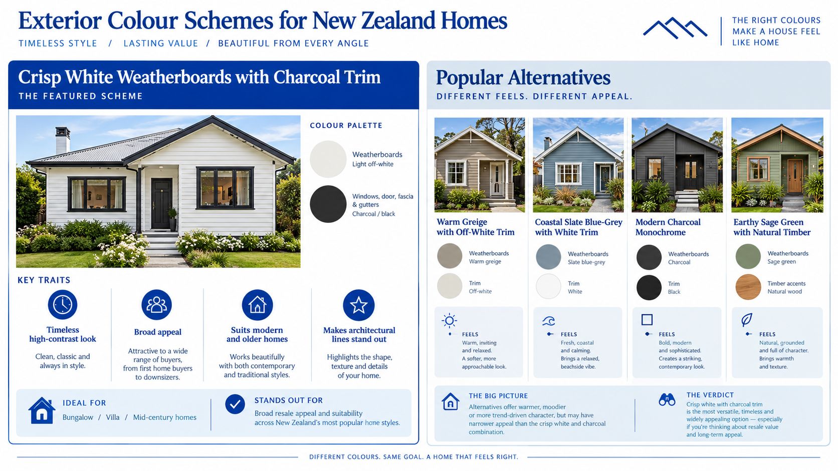
2. Warm Greige with Off-White Trim
Greige brings together grey and beige, giving a façade a contemporary neutral base without the coolness of some greys or the brightness of white. Paired with cream or off-white trim, it sits comfortably alongside timber decks, established planting and natural stone. It can work on weatherboards and plaster, provided the coating system is selected for the surface rather than just the colour.
The main risk is choosing a greige that turns unexpectedly pink, yellow or cold in the light around the house. A small chip won't show how the shade behaves across a wall, and a colour that works in a sunny showroom may feel flat beneath tree cover or overcast skies.
Test the undertone, not just the shade
Paint large sample boards and compare several warm greiges side by side. Look at them in morning and afternoon light, and check them against the roof, paving and any timber that will remain unpainted. If the body colour is very light, a slightly deeper trim can give windows and eaves definition without introducing a hard contrast.
Ask your painter for the light reflectance value, or LRV, when the wall will be exposed to strong sun. Auckland Council guidance uses reflectivity limits for predominant wall and roof colours in specified colour groups, so it's sensible to confirm any relevant local requirements before settling on an unusually bright combination (Auckland Council colour guidance). Greige is most successful when it supports the materials and setting, not when every exterior element is forced into the same neutral.
3. Coastal Slate Blue-Grey with White Trim
Muted slate blue-grey can echo harbour water and a cloudy coastal sky without making a house feel overtly themed. White trim gives the windows and corners a crisp edge, while the cooler body colour sits naturally beside coastal planting and timber. On a weatherboard cottage near Browns Bay or the Hibiscus Coast, this combination can feel relaxed and rooted in its setting.
The trade-off is that blue can shift considerably between bright sun, cloud and dusk. A shade that seems subtle on a sunny sample board might look much darker once applied to a shaded wall. Highly saturated blues can also make fading more visible across a large façade.
Coastal rule: Keep the body colour muted, then use trim and joinery to give the house definition.
Choose a coating system suited to the cladding and coastal exposure, and use a finish that's practical to clean on trim that collects salt or grime. Satin or semi-gloss on suitable trim surfaces can make routine wiping easier, but the sheen should suit the architecture and the product specification.
Test the blue-grey in both sun and shade, and include the roof in the assessment. A warm roof colour may clash with a cool blue, while a dark neutral roof can help the palette feel more settled.
4. Modern Charcoal Monochrome
Charcoal, graphite and near-black can make a contemporary home feel composed and architectural, especially when the design has simple forms, broad glazing or mixed cladding. A pale soffit or a small light accent at the entry can stop the exterior from reading as one dark mass. Newer homes in Albany and Silverdale often pair dark cladding with black joinery, while cedar detailing can add warmth.
This is a high-impact choice with a real performance trade-off. Dark colours absorb more solar heat than lighter ones, and they can make dents, waviness and uneven preparation more noticeable. On exposed elevations, confirm that the cladding and coating system can accommodate the chosen colour, and discuss heat-reflective options with the supplier where appropriate.
Let the substrate set the limits
Preparation isn't the place to economise. Repair uneven areas, select a compatible primer and follow the coating manufacturer's instructions for the substrate. Expect the appearance and maintenance needs to be more sensitive to exposure than with a lighter scheme, particularly on walls receiving strong sun.
A dark façade can also feel imposing if the roof, gutters and joinery all have the same visual weight. Try a subtle change in tone or material instead of adding bright white everywhere. For options that take exterior materials and colour into account, see this guide to choosing colour for an exterior house.
5. Earthy Sage and Olive Green with Natural Timber Accents
Muted sage, olive and moss green connect a house to established gardens and native bush. They suit traditional homes, but they can also soften a contemporary façade that might otherwise feel stark. A cedar entry or warm timber soffit gives the palette depth; cream trim can make the windows easier to pick out.
The setting matters. A green that looks gentle on an open, sunlit wall can disappear against dense planting or read much darker beneath trees. For a bush-edge property in Torbay or Glenfield, lighter samples are often worth testing first, especially on shaded elevations.
Keep the greenery legible
Test samples against both the foliage and the parts of the exterior that won't be painted. If the house is surrounded by deep green, a lighter sage can maintain separation between building and grounds. In a more open setting, a stronger olive may feel balanced without becoming dominant.
Natural timber adds warmth, but it brings its own upkeep requirements. Check that the stain or protective finish is suited to the timber and exposure, and plan to maintain it as a separate surface rather than assuming it will weather at the same pace as the painted cladding.

6. Villa Heritage Palette
Older villas often have mouldings, brackets, sash windows and weatherboards that benefit from a considered, multi-colour treatment. Cream or ochre body colours with deep green, burgundy or brown details can give those elements definition without making every feature compete. Heritage New Zealand's research into early exterior colours describes schemes shaped by material availability, cost and durability, including earthy limewash colours on early buildings and darker greens, reds, maroons and browns becoming more prominent in the Victorian period (research on early exterior colours in Aotearoa New Zealand).
That history is a guide, not a template. A villa in Devonport or Birkenhead may have been altered over time, so the most appropriate scheme depends on its architectural details and condition. Deep colours can highlight decorative joinery, but too many competing accents can make the façade busy.
Practical rule: Use colour to clarify the villa's features, not to outshine them.
Before changing the exterior, check whether any heritage controls or consent requirements apply. Older painted surfaces need careful assessment before sanding or scraping, as lead may be present. Have an experienced painter advise on safe preparation and compatible primers, then allocate colours to the body, trim and joinery according to the actual details of the house.
For ideas suited to older homes, see these New Zealand villa colour schemes.
7. Natural Timber Stain or Oiled Cedar Finish
A stain or oil can preserve the grain of cedar and other timber cladding, giving the exterior a quieter, lower-gloss character than paint. It works well on an entry, feature wall or full façade when the timber is in good condition and the chosen finish suits the exposure. Cedar-clad homes on the North Shore often use this approach to bring warmth to a predominantly painted exterior.
The upkeep is different from a painted finish. Clear oils offer little visual change but need regular attention, while pigmented or semi-transparent stains can provide more protection against UV exposure and will alter the timber's appearance. Strongly exposed north- and west-facing walls can weather differently from sheltered elevations.
Timber isn't maintenance-free just because it hasn't been painted.
Test the product on an offcut or a discreet section first. Timber species, existing coatings and surface preparation all affect the result, so check compatibility before applying a finish across the façade. The timber also needs to be dry and properly prepared according to the product instructions.
Choose a maintenance schedule based on the product specification and the site, rather than assuming one interval suits every house. Inspect the surface regularly for fading, uneven absorption or coating breakdown, and plan to address exposed areas before the finish has deteriorated extensively.
8. Two-Tone Dark Base with Light Upper Storey
A darker lower storey paired with a lighter upper level can make a large façade feel grounded and break up a broad wall. It's especially useful on multi-level homes and townhouses, where different cladding materials or floor lines already create a natural division. The reverse arrangement can work too, but it needs careful judgement so the house doesn't feel top-heavy.
Use the building's existing lines to decide where the colours meet. A floor level, window sill or change in cladding is usually a more convincing break than an arbitrary stripe across a wall. A clean division also depends on careful masking and a suitable sequence of work.
Coordinate with the building, not the trend
Dark base colours can make a house feel stable, but a very dark, continuous ground floor may dominate a narrow frontage. Compare the scheme with the roof, paving and neighbouring homes before settling on the contrast. Test large samples, as two colours that look coordinated on a small chip may feel more sharply divided across whole elevations.
Townhouse owners should confirm any body-corporate or design requirements before changing the scheme. In managed developments, consistency across façades may matter as much as the individual preference of one owner. For new builds and multi-unit projects, government guidance also treats cladding and roof colour as part of how a building relates to its neighbourhood, making coordination an important design decision (Kāinga Ora exterior colour choices).
9. Warm Terracotta and Earth Tones
Terracotta, clay, rust and sand shades can bring warmth to plaster, masonry and stucco. A restrained body colour with cream or warm-white trim feels more settled than using a strong terracotta across every surface. The palette can suit homes with Mediterranean or Spanish-inspired details, while a terracotta door or feature wall can add character to a more neutral exterior.
The challenge is scale. Warm colours often look stronger over a full façade than they do on a sample, particularly in direct sun. Test the chosen shade on both a sunny and shaded elevation, and compare it with the roof, brickwork and greenery before deciding whether it belongs on the whole body or just an accent.
Match the coating to the surface
Plaster and masonry need a coating system suited to their condition and construction. Check for moisture issues and existing coating problems before painting, and use the primer and topcoat specified for the substrate. A colour alone can't compensate for poor surface preparation.
For a balanced scheme, pair the warm body or feature colour with quiet trim rather than adding several different accents. If the house has brown or sand-coloured elements, compare those undertones with the proposed terracotta before committing; ideas for brown exterior house colours can help with that comparison.
10. Bold Feature Front Door with Neutral Base
A teal, navy, red or yellow front door can give a white, grey or greige house personality without committing the entire façade to a strong colour. It's a relatively contained way to refresh street appeal, and it can work on a weatherboard home as well as a newer plaster or mixed-cladding exterior. The door becomes the focal point, so the rest of the palette should support it rather than compete.
Start by looking at the roof, wall colour and nearby planting. A bright door that works against a warm white may clash with a cool grey, and a bold colour can feel out of place if the house's architectural style points toward a more restrained treatment. Check the colour on the actual door or a sample placed beside it.
Use a coating made for exterior doors and follow the preparation instructions for the existing surface. A semi-gloss or gloss finish can be practical on a frequently handled door, provided the product suits the material and the finish level fits the home. Clean and inspect the door as part of routine exterior maintenance, then repaint when fading, wear or damage makes it necessary.
10 Exterior House Colour Schemes Compared
| Exterior Scheme | Implementation Complexity | Resource and Maintenance Needs | Expected Outcome | Ideal Use Cases | Key Advantages |
|---|---|---|---|---|---|
| Crisp White Weatherboards with Charcoal Trim | Low to moderate; standard two-colour application | Clean pale surfaces regularly; use UV-resistant coatings on dark trim | Clean, high-contrast, classic appearance | Weatherboard and plaster homes; older or modern styles | Broad appeal, highlights architectural lines, reflects heat |
| Warm Greige with Off-White Trim | Low; simple, coordinated palette | Standard exterior preparation and periodic cleaning | Warm, contemporary, understated appearance | Modern homes and renovations; homes with timber or natural landscaping | Forgiving of dirt, adaptable, less glare than white |
| Coastal Slate Blue-Grey with White Trim | Low to moderate; careful colour testing recommended | Salt rinsing and quality UV-resistant coatings | Relaxed, coastal character with clear trim contrast | Waterfront and coastal homes | Suits coastal surroundings and hides minor weathering |
| Modern Charcoal Monochrome | Moderate; preparation must be thorough | High-quality coatings; inspect regularly and expect potentially shorter repaint cycles | Bold, contemporary look that emphasises form and texture | Contemporary new builds and modern renovations | Strong street presence; suits black joinery and modern landscaping |
| Earthy Sage and Olive Green with Natural Timber Accents | Low to moderate; test colours in sun and shade | Monitor shaded areas for mould; maintain timber accents | Natural, garden-integrated appearance | Bush, garden, and natural-style settings | Blends with greenery, hides weathering, complements timber |
| Villa Heritage Palette | High; multiple colours and detailed masking | More preparation and labour; inspect timber and check heritage rules | Traditional, detailed character with highlighted ornamentation | Villas and character homes with decorative timber | Enhances heritage features and kerb appeal |
| Natural Timber Stain or Oiled Cedar Finish | Moderate; timber must be properly prepared and dry | Frequent upkeep: clear oils every 1–2 years; pigmented stains every 3–5 years | Warm, low-gloss finish that shows timber grain | Cedar cladding, timber features, and natural-style homes | Showcases timber texture; refreshes more simply than a full repaint |
| Two-Tone Dark Base with Light Upper Storey | Moderate; precise masking and proportion planning needed | Standard repainting; extra care to maintain clean division lines | Breaks up large facades and balances building proportions | Two-storey homes, townhouses, and multi-level properties | Adds visual interest and reduces the appearance of bulk |
| Warm Terracotta and Earth Tones | Low to moderate; test colours in different light | Exterior-grade coatings; monitor plaster for fading or chalking | Warm, distinctive appearance | Plaster, brick, and stucco homes | Adds character and complements timber and terracotta roofing |
| Bold Feature Front Door with Neutral Base | Low; limited to the door or entry feature | Repaint door every 3–5 years; inspect seals and hardware annually | Personalised entry with a neutral overall exterior | Homeowners seeking a low-cost exterior refresh | High impact, easy to change, preserves a buyer-friendly base |
Move From Swatches to a Durable Finish
A strong scheme is a coordinated property system, not a set of attractive paint chips. Compare the body colour with the trim, roof, fencing, cladding, paving and landscaping that will remain. A colour that looks refined on a weatherboard cottage may not suit plaster, cedar or brick in the same way, and a dark roof can change the balance of the whole façade.
Test large samples on more than one elevation and review them in different daylight. North- and west-facing walls receive greater solar exposure than sheltered south-facing ones, and the BRANZ findings on UVA exposure show why colour and coating performance shouldn't be judged from one small sample or one side of the house alone. Where heat is a concern, ask about LRV and confirm that the selected colour is suitable for the substrate and coating system.
Check any heritage or body-corporate requirements before ordering paint. If the house has older timber, plaster or masonry, get substrate-specific advice on repairs, primers and topcoats. Preparation-led application matters in coastal conditions: washing away salt and grime, addressing loose or damaged paint, allowing surfaces to dry, and using appropriate primers can all help the finish perform as intended.
Resene and Dulux offer exterior systems for different substrates and conditions, but the right choice depends on the house and its exposure. Painters North Shore includes residential colour consultation with exterior painting quotes, helping homeowners coordinate body, trim and accent colours with the roof, materials and setting. A useful reference for considering exterior materials as part of a broader design is this practical guide for architects and builders.
Before committing to a palette, view the samples on the actual house, assess them in sun and shade, and confirm that the finish suits the surface. That small amount of checking can prevent a colour that looks right in isolation from becoming an expensive mismatch across the whole property.
Painters North Shore provides residential exterior painting, preparation-led surface work and colour consultation for homes across Auckland's North Shore. To discuss a scheme that suits your cladding, roof and coastal exposure, contact Painters North Shore.