A homeowner stands at the front door with a fresh coat of paint drying and a decision still to make: black, navy or warm cream? The colour sets the entrance's character, but it's only part of the job. Preparation, primer, sheen and sun exposure all affect how that door looks after a few summers, particularly on a North Shore property exposed to coastal moisture and wind-driven rain.
A painted exterior door is part of the building envelope, so its finish needs to do more than look good. New Zealand guidance links protective coatings and regular maintenance with moisture control and durability, including sealing exposed timber surfaces and keeping the coating intact (New Zealand guidance on window and door frames). That's why each idea below pairs a colour with the practical decisions behind it, from surface preparation to finish and exposure.
If you're weighing up exterior hues, use the house's cladding, roof and surroundings as your starting point, then test samples on the actual door. The examples below are a decision guide, not just a colour mood board.
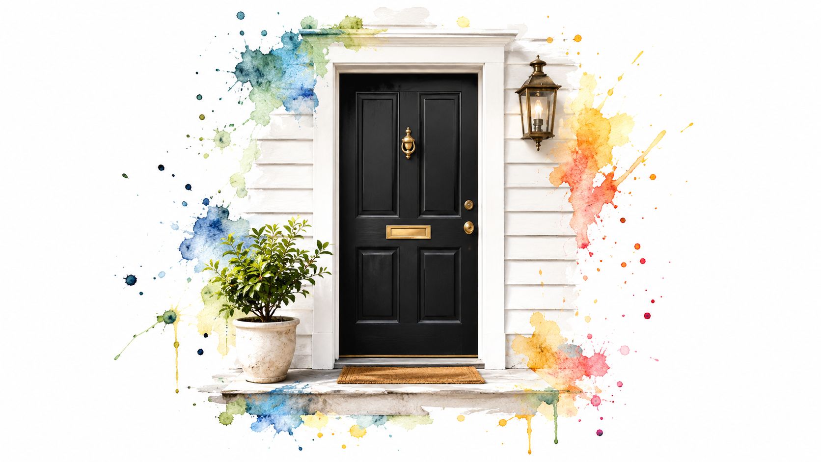
1. Matte or Satin Black Front Door
Black gives an entrance a clear outline against white weatherboards, cream plaster or brick. It suits both a character villa with traditional detailing and a modern home with timber cladding and dark joinery. The trade-off is heat: dark colours absorb more solar energy, so a door in direct sun needs careful assessment rather than an automatic choice of black.
Before painting, check the condition of the existing coating and the timber beneath it. Wash away salt and grime, sand sound paint to provide a key, and repair loose or damaged areas. If the home is older and the existing paint may contain lead, don't start sanding until the coating has been assessed. A premium exterior enamel or acrylic enamel is a better fit than interior wall paint, and a dark-tinted primer can help the topcoat cover evenly.
Choose a sheen that suits the doorway
Satin is a practical middle ground for a front door. It gives the surface a cleanable finish without the strong reflections of gloss, and it tends to show fewer minor surface irregularities than a high-sheen coating. Matte can look striking, but it may be less forgiving where hands, weather and regular cleaning mark the finish.
A black door on a heritage-style villa with cream weatherboards can look crisp with brass hardware. On a newer two-storey home, satin black can tie in with dark aluminium joinery and timber accents. In either case, check the colour's light reflectance value and consider how much direct sun reaches the door.
Practical rule: Don't treat a black face as the whole job. Coat the edges, top and bottom as well, so vulnerable timber isn't left exposed.
For a coating plan that includes preparation and the door's exposed edges, review exterior door painting options. Before committing, test the black on the door itself, then decide whether satin or matte better suits the surface and the amount of daily use.
2. Deep Navy Blue Front Door
Navy offers much of black's definition but feels softer at the entrance. On a white or cream weatherboard home, a deep blue door makes a deliberate focal point without dominating the whole façade. A blue-grey or midnight shade can also sit comfortably beside cedar cladding and white trim, which makes navy useful when the house already has a mix of natural and painted materials.
Don't choose navy from a small colour card alone. Paint sample patches on the door and view them in morning light, bright afternoon sun and shade. Blue can shift noticeably with the surrounding colours, and the house's cladding may make a sample look cooler or warmer than expected.
Protect the vulnerable edges
Preparation matters as much as the chosen blue. Clean the surface, address peeling or cracked areas, and use a primer compatible with the substrate and finish coat. Check the bottom edge closely, especially if the door sits near a threshold that catches rain or splashback. A well-finished face won't protect timber if moisture can enter at an unsealed edge.
A coastal home might pair a navy door with white weatherboards and a restrained matching detail on the fence or letterbox. Keep those accents coordinated rather than repeating the colour everywhere. Select a topcoat intended for exterior use and confirm it's compatible with the chosen enamel system. Where the home is exposed to salt and strong weather, compare suitable coating systems for coastal homes.
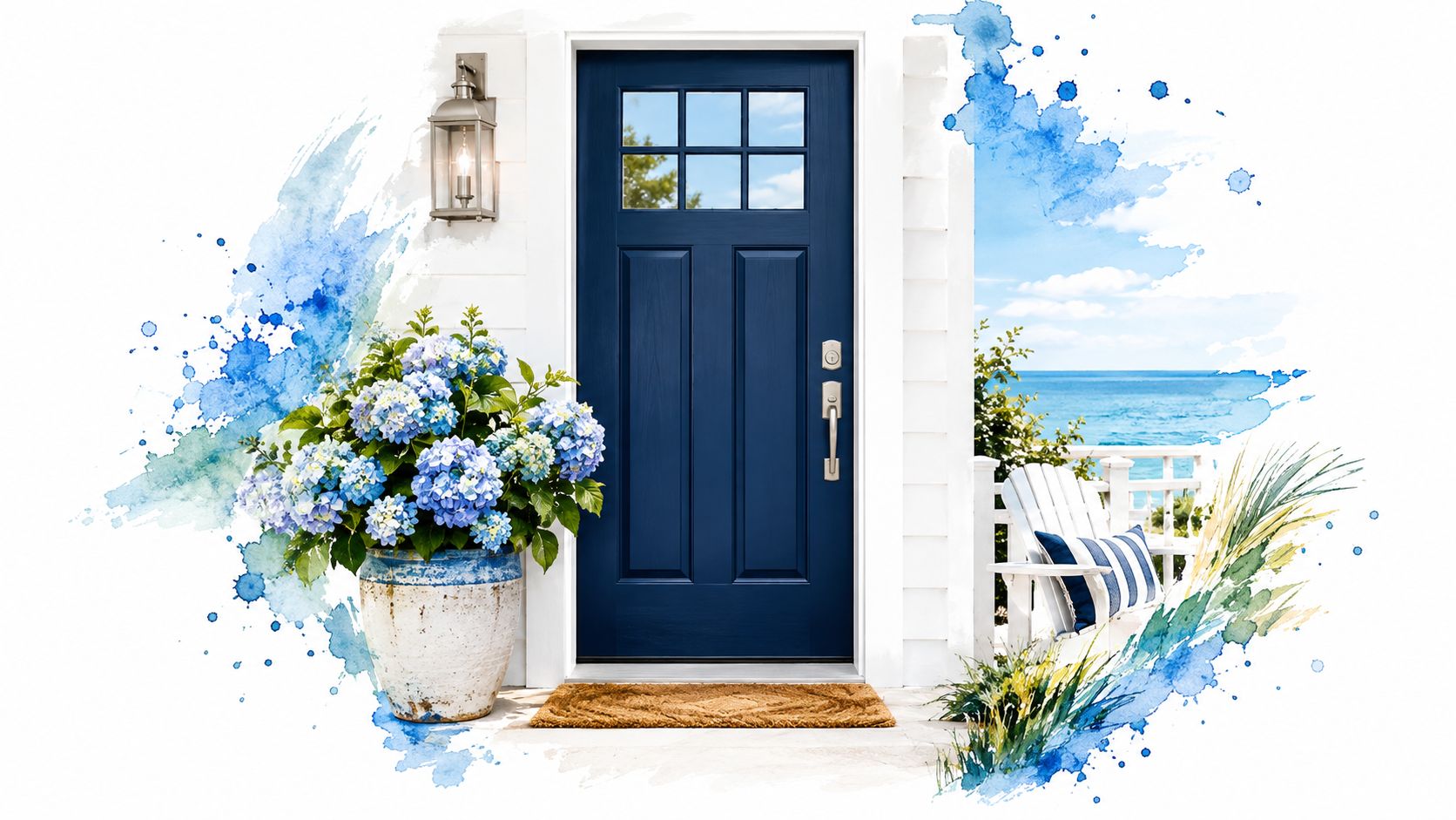
A navy door works best when its colour feels connected to the setting, not just attractive on a sample card. Test it on the door, inspect the lower edge and confirm the full coating system before painting.
3. Oxblood or Deep Red Heritage Door
On a Victorian or Edwardian-style villa, an oxblood door gives the entrance warmth and depth alongside cream weatherboards, white window frames and traditional panel mouldings. A deeper red also suits a cottage when the aim is a clear focal point that still feels at home with the existing palette. Check a large colour sample beside the cladding before committing, since the door's panels and shade affect how the red reads.
Preparation starts with the timber and existing coating. On bare or repaired timber, seal and prime with a system suited to the substrate and its condition. Timber extractives can discolour paint, so choose a compatible primer rather than expecting the topcoat to cover the problem. Clean and prepare sound existing paint, removing only what has failed. Inspect the bottom edge and joints as part of that preparation, and repair any coating breakdown before moisture can reach the timber.
Keep the details consistent
Panel mouldings and recesses cast shadows that can make deep red appear uneven. Use the same sheen across the door, and apply the finish in controlled, even coats. Avoid heavy build-up in corners and around mouldings, where paint can collect and spoil the detail.
Oxblood against a cream villa pairs well with black gutters and simple dark hardware. For a quieter cottage entrance, let deep red carry the colour without adding more accents. Satin can be practical on a door that gets frequent handling and cleaning; choose the sheen to suit the existing joinery and the finish system. Record the paint colour and product details so you can match future touch-ups more closely.
Before painting, test the colour on the door and check it in the light the entrance receives. For the villa, confirm that the red works with the cream cladding and dark hardware; for the cottage, keep the red as the main accent. Then confirm the primer and topcoat are compatible, and keep the product details for maintenance.
4. Sage and Muted Green Door
Sage, olive and eucalyptus shades connect an entrance with its surroundings. They work especially well on a treed section where native planting, timber cladding or natural stone already shapes the view. Unlike a sharp contrast colour, muted green can make the door feel like part of the natural setting while still giving the entry a distinct finish.
Start by placing colour samples beside the cladding and roofing, not just against the door. A green that looks calm on a card can become dull against a dark roof or overly yellow beside warm timber. Check it outdoors in natural light and compare it with any fixed materials that won't be changing as part of the repaint.
Balance colour and exposure
A warm white or cream trim can lift sage and stop the entrance from looking flat. Satin is a useful sheen where the door gets regular contact or needs routine washing, particularly in a coastal setting. Ask the painter to consider the colour's light reflectance value and the amount of direct sun the doorway receives. Darker, more saturated greens can absorb more heat than lighter muted tones, which may matter on exposed timber.
A sage door against timber cladding suits a restrained, natural palette. An olive door beside a bush setting and stone entry can feel grounded without adding another competing colour. In both cases, make sure the topcoat and primer suit the substrate, and coat all exposed faces and edges.
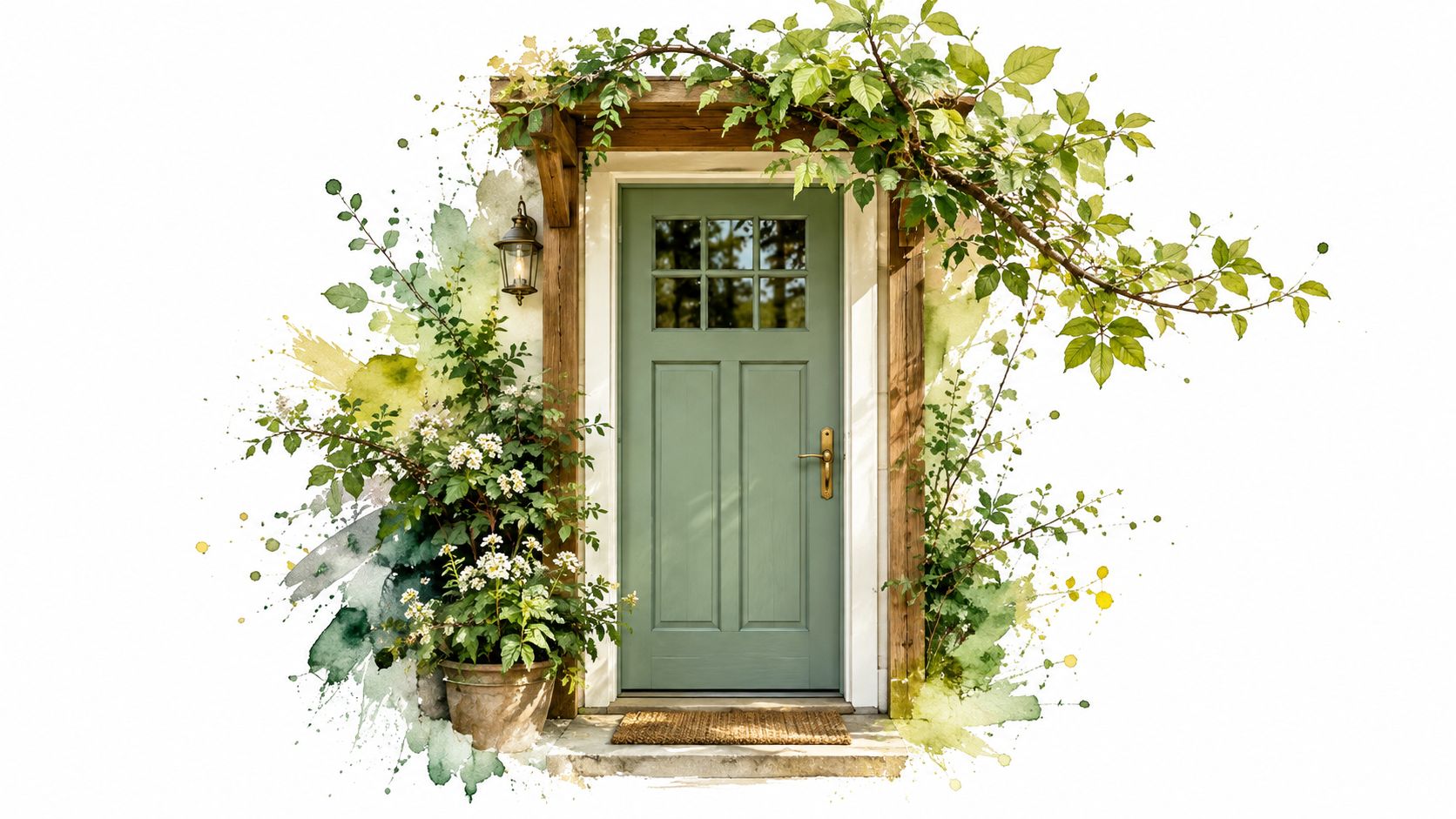
A muted green can be a quiet choice, but it still needs deliberate testing. Put samples beside the house materials, decide whether the door should blend or contrast, then confirm the finish can be maintained in its actual exposure.
5. Charcoal Grey Satin Door
Charcoal offers a contemporary alternative to black that can be easier to coordinate with mixed exterior materials. It pairs well with fibre-cement cladding, metal details and aluminium joinery, making it a natural option for townhouses and modern builds. On a renovated home, charcoal can also link newer windows or hardware with older timber features.
For accurate coverage, use a primer tint that suits the grey and the existing surface. If the door is fibreglass or metal, choose a bonding primer specified for that material rather than treating it like bare timber. Clean and scuff the surface as required by the product instructions, and don't skip repairs where the old coating has lifted.
Satin helps with everyday wear
A satin finish gives charcoal enough light reflection to read clearly without the sharp shine of gloss. It's a practical choice for a frequently used entry, where hands and surface marks are part of ordinary wear. Compare sheen options before ordering, because the same grey can look noticeably different in matte, satin and gloss. For a closer look at the trade-offs, see this guide to matte and gloss paint.
A charcoal door on a townhouse with black window frames keeps the exterior palette cohesive. Brushed-steel hardware can soften the contrast, while brass adds warmth. On a home with timber elements, charcoal can provide a clean anchor, but test it beside the timber in natural light before painting the full door.
Dark greys can also heat up in strong sun, so consider the door's orientation and shelter. A suitable topcoat and sound preparation help, but neither can correct a poor substrate choice or a door assembly that traps water. Inspect the edges, joints and seals before treating the colour as the only decision.
6. Terracotta and Burnt Orange Door
Terracotta brings an earthy warmth that feels at home with white render, stone, timber and clay-toned roof tiles. It can suit a Mediterranean-inspired façade, but it also works as a single expressive accent on a contemporary home. Burnt orange is less restrained than cream or charcoal, so the surrounding palette should give it room rather than compete for attention.
Test the colour against permanent materials before ordering paint. Roof tiles, brickwork and landscaping can make terracotta appear more red, brown or orange than it looked indoors. Place the sample beside those materials and view it outdoors at different times of day.
Keep the warm colour protected
Warm reds and oranges can be vulnerable to fading, especially on a door that receives strong sun. Choose an exterior coating system intended for the substrate and confirm its suitability for the selected colour. Prepare the surface carefully, repair failed paint and prime where required. At the threshold, check that the bottom edge and surrounding junctions are sealed and that water can drain away.
On a rendered home, terracotta can make a welcoming counterpoint to a pale façade. On a modern home with natural timber and stone, a deeper burnt orange can bring warmth without extending the colour across the whole exterior. Use the colour on the door alone unless another feature clearly needs to repeat it.
Don't paint over a moisture problem. If paint is peeling at the bottom or bubbling around a joint, inspect the door's edges, seals and drainage details before recoating. Addressing the source first gives the new finish a sounder surface to protect.
7. Two-Tone Panelled Door
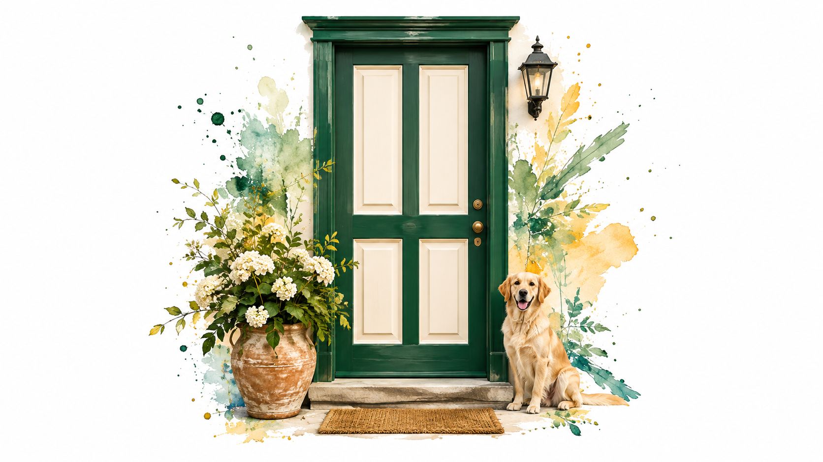
A two-tone finish can bring out a panelled door's shape without making the whole entrance a single bold colour. Use one colour across the main surface and another on the stiles, rails or mouldings. A navy panel framed by black can feel graphic on a period-style entry, while cream panels inside a deep green frame can add detail to a villa renovation.
The clean lines depend on patient preparation and paint order. Work out the colour boundaries before masking, then check that the door is clean and sound. Low-tack painter's tape can help, but it won't compensate for dust, loose paint or an uneven surface. If one colour is much lighter, paint it first, let it dry as directed and mask carefully before applying the darker colour.
Make the detail durable, not fussy
Panel joints and mouldings can collect water if the coating is incomplete or the details are already cracked. Inspect these areas closely, repair defects and apply the coating across the full surface. Avoid leaving thick ridges of paint where the two colours meet, especially if the door's panels move with changes in moisture.
A heritage door with navy panels and black stiles can echo dark hardware, while a green frame with cream panels can tie into a lighter trim palette. Before starting, check both colours against the house rather than judging them in isolation.
For a closer look at panel preparation and clean colour boundaries, watch this panelled-door painting demonstration. Use the demonstration as a visual reference, then follow the coating manufacturer's directions for your own door and substrate. The practical next step is to mark the colour boundaries, test both shades on the door and confirm the joints are sound before masking.
8. Warm White or Cream Door with Contrast Hardware
A warm white or cream door can suit a heritage bungalow or a coastal home with timber decking. The pale colour keeps the entrance bright, while contrasting hardware gives it definition. Black fittings create a clear outline; brushed metal is more restrained beside pale paint and natural materials.
Check the undertone against the rest of the exterior. Cream often sits comfortably with beige or warm-white trim, while a cooler white can clash with yellow-toned weatherboards or timber. Test a sample on the door and view it beside the trim, cladding and hardware before choosing.
Make cleaning part of the plan
Pale paint shows grime and hand marks sooner, so choose an exterior coating that can be washed. Satin or semi-gloss is easier to clean than a very flat finish, though a higher sheen also makes dents and uneven preparation more visible. Fill and sand defects carefully, then prime bare or repaired areas with a compatible product.
On a heritage bungalow, cream paint with a black letterbox and lanterns defines the entrance. For a coastal home, warm white can work with stainless hardware and timber decking. In either case, plan to wash exposed surfaces and inspect areas where salt, rain or grime collect.
Match maintenance to the door's exposure. Wind-driven salt spray and everyday dirt can affect the coating, so wash the surface and recoat when the finish begins to wear. Before painting, inspect the edges, joints and seals, and repair any gaps or damage that could let water in. Check these areas closely before opening the paint tin.
8 Painted Exterior Door Styles Compared
| Door Style | Implementation Complexity | Resource Requirements | Expected Look | Key Advantages | Ideal Use Cases |
|---|---|---|---|---|---|
| Matte or Satin Black | Low; standard preparation and application | Exterior enamel, suitable primer, two topcoats | High-contrast, grounded, classic | Timeless; pairs with many exterior palettes; satin is easy to clean | Traditional or contemporary homes seeking a bold entrance |
| Deep Navy Blue | Low; sample in different lighting before choosing | UV-resistant exterior enamel, primer, two topcoats | Welcoming, refined, coastal | Strong kerb appeal with a softer feel than black | Coastal homes and white or cream exteriors |
| Oxblood or Deep Red | Low to moderate; careful colour and timber preparation | Lightfast exterior paint, timber primer and sealer | Warm, dramatic, heritage-inspired | Complements period architecture; distinctive alternative to dark neutrals | Villas, cottages and character homes |
| Sage and Muted Green | Low; test against cladding and natural light | Exterior paint, suitable primer, satin topcoat | Calm, natural, landscape-friendly | Blends with greenery; lighter shades absorb less heat | Bush or garden settings and homes with timber or stone |
| Charcoal Grey Satin | Low; colour matching and primer selection matter | Fade-resistant paint, grey-tinted primer, satin topcoat | Contemporary, understated, coordinated | Versatile with mixed materials; durable, easy-care sheen | Modern homes, townhouses and new builds |
| Terracotta and Burnt Orange | Low; test against roof, brick and landscaping | UV-stable exterior enamel, primer and sealer | Warm, earthy, distinctive | Complements natural materials; can disguise dust | Mediterranean-inspired homes or earthy facades |
| Two-Tone Panelled Door | Moderate to high; precise masking and cutting-in required | Two paint colours, primer, painter's tape and joint sealer | Detailed, layered, architectural | Highlights craftsmanship; offers controlled colour contrast | Panelled doors on villas and period homes |
| Warm White or Cream with Contrast Hardware | Low; select undertone and sheen carefully | Exterior acrylic enamel, primer, satin or semi-gloss topcoat | Light, open, classic | Reflects heat; coordinates easily with light exteriors | Coastal homes and entrances needing a light, welcoming look |
Turning Your Door Choice Into a Painting Plan
Start with the architecture, then choose the colour family. Black and charcoal make a strong outline, navy brings depth without quite the same severity, and muted green can connect the entrance with planting and timber. Oxblood and terracotta add warmth, two-tone finishes highlight panel detail, and cream keeps the doorway light. None of those choices is automatically right for every house, so compare the door with the cladding, roof, trim and hardware before deciding.
Test sample patches on the actual door. Look at them in different light and from the street, then consider how direct sun, shelter and coastal exposure may affect the colour and coating. Darker colours can increase heat loading on sun-exposed timber, while pale surfaces may need more frequent cleaning to keep them looking fresh. Ask your painter to recommend a primer and exterior topcoat suited to the substrate and exposure, not just the colour.
Make preparation visible in the quote. Washing, sanding, filling, priming and masking all take time, but they determine whether the coating has a sound surface and whether the finished door looks even. The specification should account for the entire door, including the top, bottom and side edges, not only the face visible from the street. New Zealand guidance treats exterior protective finishes and their maintenance as part of moisture performance, and identifies regular inspection and timely repairs as important to preserving weathertightness (door frame and moisture guidance).
If the door is older, assess the existing coating before sanding. A new coat over sound paint may be safer than aggressive removal, but flaking or hazardous coatings need an appropriate plan to protect the household and surrounding areas. Ask the painter to identify any substrate defects, coating concerns and moisture-prone junctions before work begins.
Painters North Shore includes colour consultation with residential quotes and can assess sun and salt exposure on site before paint is ordered. Ask for an on-site assessment that records the door's condition, the preparation required, the primer and finish system, and how the edges and hardware will be handled. That gives you a clear painting plan before the first coat goes on.
Painters North Shore provides residential exterior painting and can assess your door's exposure, surface condition and coating needs before work begins. Visit Painters North Shore to discuss a colour consultation and request a preparation-led quote for your exterior door.