
You can tell a fence has turned into a decision point the moment you stand in the driveway with a few test pots in one hand and a weathered timber panel in the other. On the North Shore, that choice isn't just about taste. Salt air, strong light, and constant weathering mean fence paint colours have to work hard, look right from the street, and age without drawing attention to every mark and patch.
A good colour can make a fence recede into planting, sharpen a modern façade, or sit unobtrusively behind a heritage home without fighting the architecture. A poor one can look flat in morning sun, chalk out early, or demand repainting sooner than you planned. The practical way to choose is to start with local exposure, then match the shade to your home, your materials, and the way you want the boundary to behave visually.
If you're also planning an outdoor refresh beyond the fence, a useful reference is elevate your luxury patio project, because boundary colour and nearby hardscaping often need to work together, not separately.
Choosing Your Fence Colour Is More Than Just a Trip to the Paint Shop
A North Shore homeowner can walk into a paint store feeling sure they want “something dark” or “something neutral”, then change their mind three times after seeing swatches in daylight. I've seen that happen most often when the fence is already weathered and the house has mixed materials, because the colour has to suit more than the sample card. It has to sit beside planting, paving, roof colour, and the way coastal light hits the property all day.
The local reality is that fence paint colours are tied to durability as much as appearance. Resene's exterior guidance treats darker, earth-toned, and low-chroma shades as useful because they visually recede and disguise weathering, which matters when a fence is exposed to UV, wind, and salt. In Auckland's coastal suburbs, that's not a styling preference. It's a maintenance decision.
Why the North Shore changes the colour conversation
Coastal light can make pale colours look brighter and darker colours look flatter than they did under showroom lighting. That's why test patches matter so much on the Shore, especially on fences facing open sky or reflected light from water and pale paving. The same colour can read calm in a shaded backyard and much harsher along a sunny boundary.
Practical rule: choose the colour in the light your fence actually lives in, not the light of the paint shop.
If your outdoor area is part of a wider design refresh, keep the fence aligned with the surrounding surfaces. That's where colour choice starts to feel less like decorating and more like property planning. A fence that works with the house and landscaping usually stays appealing longer because it doesn't depend on novelty to look good.
Critical Factors for Choosing Fence Colours on the North Shore
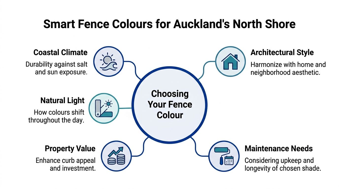
The first thing I tell clients is that a fence colour has to survive the environment before it can impress the neighbours. Auckland's coastal properties deal with UV, salt, moisture, and strong directional light. Those conditions change how paint looks, how fast it weathers, and how often it needs attention.
Start with the exposure, not the swatch
Most general colour advice misses the fact that coastal microclimates are rough on coatings. Guidance on external finishes consistently treats local exposure as part of the product decision, which is why colour can't be separated from the coating system itself. In practice, that means the fence colour that looks elegant inland may need a different finish or maintenance approach near the water.
Dark colours can be beautiful, but they're not automatically forgiving. Technical coating data note that dark exterior coatings increase solar heat gain, which raises surface temperature and can speed up breakdown. On North Shore sites with strong sun and salt exposure, a low-sheen or lighter option often reduces thermal stress while still looking polished.
Match the shade to the house, not the trend
A fence should frame the home, not compete with it. Dark recessive colours suit modern builds because they sharpen lines and let the architecture carry the visual weight. Softer neutrals usually work better when the façade already has strong texture or detailed trim, because the boundary stays calm instead of becoming another focal point.
That judgement matters for resale presentation too. Trendy dark colours can look excellent in one street and too heavy in another, especially where fences need to sit beside brick, weatherboard, and layered planting. The right choice usually depends on whether you want the fence to disappear into the background or act as a deliberate visual edge.
Think about the planting and the streetscape
If the garden is the hero, a recessive fence lets the foliage do the talking. If the frontage is minimal and architectural, the fence can be darker and more defined. Both approaches work, but only when they suit the home's age, materials, and surrounding context.
Coverage, substrate, and finish all matter
Technical data for fence paints show wide coverage variation depending on porosity, and spraying creates material loss. A rough timber fence absorbs more and needs stricter prep than a smoother panel, so the colour has to be applied within the coating system's specified film build to perform properly. That's the point most DIY jobs miss.
A fence that's chosen well but applied poorly still fails early. That's why colour, preparation, and product system should be treated as one decision, not three separate ones.
Recommended Fence Colour Palettes for Lasting Appeal
North Shore fences usually fall into three colour families that age better than chasing whatever shade is trending this year. Resene's exterior guidance consistently favours darker, earth-toned, and low-chroma options because they recede visually and disguise weathering, which suits coastal suburbs where maintenance cycles are shorter. That doesn't mean every fence should be dark. It means the safest palette is the one that fits exposure, architecture, and upkeep tolerance.
| North Shore Fence Colour Palette Comparison | Best For Home Styles | Coastal Durability | Maintenance Notes |
|---|---|---|---|
| Recessive Darks | Modern homes, minimalist new builds, bold landscapes | Good at hiding visual wear, but heat gain can be a concern on exposed sites | Needs quality coating and careful product choice to manage fading and softening |
| Coastal Neutrals | Weatherboards, renovated villas, mixed-material façades | Often the most forgiving in bright, exposed settings | Hides some dirt, but lighter tones can show staining if the fence is heavily splashed |
| Classic Naturals | Traditional homes, cottages, relaxed garden settings | Works well when you want the fence to blend into planting | Timber tone can feel timeless, but stain and repaint rhythm still matters |
Recessive darks
Charcoal, deep green, and near-black finishes create a strong backdrop for planting. They're useful when the garden is lush and you want leaves, trunks, and seasonal colour to stand out. They also suit contemporary homes with clean lines, because the fence becomes a quiet boundary instead of a bright object.
Coastal neutrals
Warm greys, soft taupes, and off-whites sit comfortably beside weatherboard and painted trim. They're often the safest choice when the house already has enough contrast or when the boundary is highly visible from the street. If you're comparing boundary shades with broader exterior colours, the guide on outside house paint colours is a useful companion.
Classic naturals
Earthy browns and timber stains work when you want the fence to feel grounded and traditional. They suit gardens with warm planting and homes that already use timber details. For properties with brown exterior elements, a practical reference on maintaining brown exterior house colors can help you think about how similar tones behave across the façade.
Matching Your Fence Colour to Your Home's Style
A good fence colour feels like it belongs to the house, even before anyone notices it. A bad one makes the boundary look bolted on. The easiest way to avoid that problem is to read the architecture first, then pick the colour family that reinforces it.

Modern homes
Clean-lined new builds usually handle dark, recessive fence colours well because the boundary becomes part of the composition. Deep charcoal or forest tones give structure to glass, plaster, and sharp rooflines. If the home already uses strong contrast, the fence should usually stay calm rather than shouting for attention.
Heritage villas and bungalows
Older homes need more restraint. Soft off-whites and traditional greens tend to respect the trim, verandas, and decorative details without flattening them. In these streetscapes, a fence that's too stark can feel out of step with the house, even if the colour itself is attractive.
Coastal baches and cottages
Relaxed seaside homes often look best with lighter, airier neutrals that reflect the informal feel of the setting. These tones keep the boundary from looking heavy in bright coastal light. They also help smaller sites feel less enclosed, which matters when the fence sits close to living spaces or narrow paths.
For homeowners weighing curb appeal against long-term value, the core issue is fit. General advice on trendy dark colours often doesn't answer whether they help or hurt perceived value in suburban streets, and that's why mixed-material façades need a more careful read. If you're unsure where your home sits on that spectrum, the guide on colour for exterior of house is worth using alongside your fence samples.
A clear visual example helps here. A modern boxy home beside a dark privacy fence often looks sharper because the eye reads the architecture first. A villa with decorative trims, by contrast, usually benefits from a softer boundary that supports the house instead of competing with it.
Choosing the Right Finish for Coastal Durability
On the Shore, the finish matters almost as much as the colour. A fence that looks good on day one can still disappoint if the coating is too glossy, too thin, or too heat-sensitive for the site. Low-sheen acrylic systems are often the workhorse choice because they're less reflective, more forgiving on imperfect timber, and better suited to busy outdoor conditions.
Why low sheen usually wins
Glossy finishes show surface variation more readily, especially on older fences with patch repair or uneven grain. They can also throw more glare in direct sun, which makes colour read harsher than expected. A low-sheen surface softens both the appearance and the maintenance story.
Dark coatings need extra care because they absorb more heat. That can raise the fence temperature, which increases stress on the paint film and can make cheaper products age badly. Lighter or lower-sheen colours usually reduce thermal loading, which helps premium exterior systems keep their shape and finish for longer.
Maintenance is part of the colour choice
A dark fence can hide dirt well, but it still needs washing and periodic repainting. Bright or very pale colours may stay visually crisp for a while, yet they can show staining and patchiness sooner in exposed coastal conditions. The right answer is usually the shade that ages in a way you can live with between recoats.
A fence colour should be chosen for the year it's in, not just the week after it's painted.
If you're comparing finish options across the whole property, it helps to think in terms of performance, not just appearance. That's where a fence system should be matched to the timber, the primer, and the exposure on each side of the boundary.
How Professional Prep and Application Elevate Your Results
The biggest fence colour mistake I see is choosing the right shade and then losing it to poor prep. Salt residue, grime, chalking, and loose fibre all interfere with adhesion, which means the finish fails long before the colour itself goes out of style. A professional process starts by cleaning the fence properly, then sanding, repairing, and priming to suit the substrate.

Why application method changes the result
Technical data for fence paints show wide coverage variation depending on substrate porosity, and spraying increases material loss. A rough, weathered timber fence needs more paint and tighter preparation than a smooth panel to reach the manufacturer's specified dry film thickness, which is critical for durability. That's where professional application protects the result, because film build is part of performance, not a technicality.
Spraying also changes how the colour lands on the fence. Done properly, it gives a more even finish on large runs and makes it easier to maintain consistency across boards and posts. Done badly, it wastes material and leaves the coating too thin to do its job.
If you're looking at different approaches for other outdoor timber work, the examples on LP SmartSide shed paint for Georgia can be useful as a general reminder that substrate and exposure drive finish decisions, even when the structure changes.
What a proper North Shore service should include
A solid fence repaint should cover washing, substrate repair, correct primer selection, masking, and a topcoat system suited to local conditions. That's also where a local crew can help with colour consultation, because testing samples in the actual light of the property avoids surprises that showroom cards can't catch. For homeowners wanting a fence-specific service, fence painting Auckland is the most direct place to start.
Painters North Shore can handle fence staining, painting, and oiling as part of a preparation-led exterior scope, which makes the colour choice easier to execute properly on site. The value is in matching the shade to the fence material and the way the property weathers, not just picking a colour that looks good online.
If you want a fence colour that looks right in North Shore light and still holds up to salt, sun, and regular weathering, talk to Painters North Shore about a site-specific colour check and a coating system matched to your fence. They can help you compare shades against your home, your planting, and the exposure on your property, so the finish looks sharp for longer.


