
Dark exterior colours are everywhere in North Shore design feeds, and they can look superb on the right house. But the popular advice to “go as dark as possible” ignores the part that matters after the reveal photos: colour affects heat gain, coating stress, substrate movement and maintenance.
A clifftop home in Castor Bay doesn't experience the same conditions as a sheltered property in Milford. Orientation, salt-laden air, UV exposure, roof colour, cladding and surrounding planting all change how a colour performs. The most successful house exterior colours balance appearance with the building's exposure and materials, rather than treating paint as a decorative final layer.
New Zealand has never had one fixed exterior palette. From the 1860s and 1870s, homes commonly used soft, natural colours such as fawns, greens, red-browns and yellows, with white reserved for ornamentation. From the 1880s to the First World War, weatherboards moved towards darker, richer colours, with chocolate, maroon and green often used on trims, as recorded in Te Ara's history of New Zealand housing. That history is useful because it shows local materials, taste and practical painting traditions have always shaped exterior colour.
Why the Best-Looking Colour May Not Be the Smartest Choice
A deep charcoal facade can give a plain North Shore home strong architectural presence. It sharpens window lines, makes timber details stand out and works naturally with contemporary landscaping. The problem starts when the same colour is applied across large, exposed elevations without considering how much solar energy the surface will absorb.
Dark surfaces generally absorb more solar energy than light ones. Building.govt.nz recommends lighter wall and roof colours, or solar and heat-reflective paints, because darker facades attract more heat. On a North Shore house, that heat combines with high UV, humidity and salt carried by coastal winds. The coating doesn't fade in isolation. Repeated heating and cooling can place additional stress on paint films, sealants and cladding.
Site rule: Choose the colour for the wall, orientation and substrate, not just for the sample board.
Timber weatherboards are particularly sensitive to movement. A dark coating on a sun-facing elevation can contribute to higher surface temperatures, while moisture and coastal exposure continue attacking vulnerable joints and edges. Plaster and fibre-cement systems have different movement and repair issues, but they also need a coating strategy that suits the substrate rather than a fashionable colour alone.
The maintenance cost is often hidden at the time of selection. A palette may look crisp when finished, yet show chalking, fading or uneven weathering sooner on a north or west-facing wall than on a sheltered elevation. That doesn't mean every dark colour is unsuitable. Resene's colour technology guidance explains that Light Reflectance Value and Total Solar Reflectance help estimate heat behaviour, and that its CoolColour formulations can allow some dark colours to reflect more heat than standard dark pigments.
The practical decision is a compromise. Use visual weight where it helps the architecture, but reserve the most heat-absorbing tones for sheltered elements, recessed joinery or smaller accents when the site is highly exposed. A durable colour plan is a long-term investment in the building envelope, not just a styling choice for the day the scaffolding comes down.
Three Principles That Govern Every Exterior Colour Decision
Colour selection becomes much easier when you stop judging a swatch in isolation. On a North Shore site, three things govern the result: light behaviour, proportion and material compatibility.
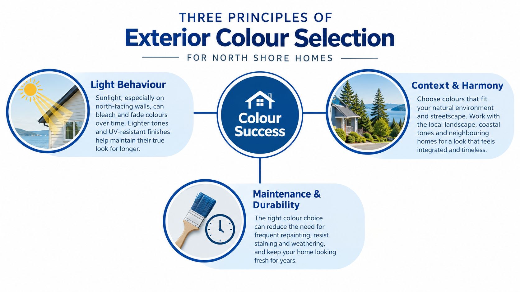
Light changes the colour you think you chose
A colour sample viewed beside a showroom window tells you very little about a full elevation. North-facing walls receive stronger direct sun and can make warm colours appear brighter or less subtle. South-facing walls tend to hold deeper, cooler impressions because they receive less direct light. A colour that feels calm on a shaded Devonport villa may look much lighter on a sunny Takapuna weatherboard.
Trees, neighbouring houses, paving and roof surfaces also reflect colour onto the facade. Test samples on more than one elevation, and view them in morning, midday and late-afternoon conditions. Don't choose a warm neutral solely because it looked balanced under artificial lighting.
Proportion gives the palette structure
A useful starting point is the 60/30/10 approach. Treat the main wall colour as the dominant field, use a secondary colour for trims or architectural breaks, and keep the strongest accent for doors, shutters or selected details. It isn't a rigid decorating law, but it prevents a large house from becoming visually busy.
On a villa, the main body might carry a restrained warm neutral, with darker trims defining verandah posts and window surrounds. On a low mid-century home, the roofline and horizontal weatherboards may already provide strong visual direction, so the accent needs to stay controlled. A bold front door can work better than a bold band around the entire building.
The substrate sets the boundaries
Weatherboard, brick, stucco, cedar and fibre-cement don't receive colour in the same way. Cedar has natural grain and movement, so an opaque coating, semi-transparent stain or oil creates very different maintenance expectations. A Birkenhead cedar home needs a timber-specific approach, while a plastered monolithic build in Albany may need crack assessment, sealing and a coating that accommodates minor surface movement.
Brick can look heavy under a dark, low-sheen coating, while a smooth plaster finish may expose every preparation mark under a strong side light. Sheen also matters. A flatter finish can reduce glare and disguise minor texture, but it won't compensate for poor cleaning, chalk removal or failed adhesion. The right palette begins with the material already on the house.
How Heat and UV Exposure Change Colour Performance
Two technical measures help explain why a colour behaves differently from its appearance on a card. Light Reflectance Value, or LRV, describes how much visible light a colour reflects. Total Solar Reflectance, or TSR, considers a broader portion of solar energy, including wavelengths that affect heat gain.
Resene notes that exterior colours with an LRV above 85% can be too bright for many exteriors, while its CoolColour system changes pigment behaviour to reflect more solar energy. That distinction matters because a dark colour isn't automatically destined to fail, and a light-looking colour isn't automatically ideal. The formulation, substrate and exposure all contribute.
ColorCote's published TSR data gives a clear comparison. Black is listed at 7% TSR, Grey Friars at 26%, Off White at 69% and Pacific White at 73% in its pre-painted product data (ColorCote TSR guidance). In that comparison, Pacific White reflects roughly ten times as much total solar energy as black. The practical implication is straightforward: lower-TSR colours can reach higher surface temperatures and place more stress on coatings during repeated exposure.
Read the metrics as risk indicators
LRV and TSR don't provide a guaranteed repaint date. They help identify where a dark colour deserves closer scrutiny. A black or near-black finish on a north-facing timber wall at a clifftop site carries a different risk profile from a dark accent beneath a covered porch in Milford.
| Colour range | Peak surface temperature | Expected coating lifespan | Maintenance risk |
|---|---|---|---|
| High-reflectance light colours | Lower heat gain relative to dark colours | Generally more forgiving on exposed elevations | Lower thermal stress, though dirt and staining remain considerations |
| Mid-range colours | Moderate heat gain | Depends on substrate, preparation and orientation | Balanced option for many walls |
| Low-reflectance dark colours | Higher heat gain, especially in direct sun | More dependent on formulation and exposure | Greater risk of thermal stress, fading and earlier remedial work |
The table is a decision aid, not a promise of performance. Before choosing a demanding colour, ask for its LRV or TSR information and confirm that the coating system is approved for the substrate. The exterior house paint guidance from Painters North Shore can also help homeowners frame that discussion around cladding and exposure.
North-facing and west-facing elevations deserve the most caution. On exposed timber or plaster, a mid-tone scheme often gives a better balance than a very dark field colour. Heat-reflective formulations can widen the options, but they don't remove the need for sound substrate preparation, well-sealed joints and appropriate application conditions.
Exterior Palettes by North Shore House Style
The same colour can feel authentic on one North Shore house and forced on another. Architecture should set the starting point, while exposure decides how far you can push the palette.
Heritage villas and bungalows
Older villas and bungalows around Devonport, Birkenhead and established Takapuna streets usually have proportion, trim and verandah details worth preserving. Soft creams, stone-like fawns, muted greens and restrained heritage reds can support the original character without making the house feel like a museum piece. Darker trims can define fretwork and joinery, but too much contrast may exaggerate every line on a busy facade.
New Zealand's historic palettes included earthy tones and richer Victorian-era colours, so a heritage scheme doesn't need to rely on stark black and white to feel distinctive. Sample the body colour against the roof, brick chimneys, concrete paths and established planting before settling on a trim.
Mid-century weatherboard homes
Low rooflines and horizontal weatherboards already create a strong graphic shape. Warm greys, olive-leaning neutrals, muted coastal blues and natural timber stains can respect that geometry while bringing the house up to date. A coloured front door or carefully chosen soffit can provide the accent without turning the entire facade into a high-contrast composition.
On a sun-exposed wall, keep the strongest dark tone away from the largest uninterrupted surface. Use it on sheltered joinery, recessed entries or selected architectural elements, then let the body colour do the work of unifying the elevation.
Contemporary and mixed-material builds
Modern homes often combine plaster, fibre-cement, metal, timber and large windows. A restrained warm grey, stone or soft off-white base can help those materials sit together, while charcoal, coastal blue or timber accents add definition. Large-format dark cladding can look dramatic, but it deserves more scrutiny on exposed coastal elevations because heat and movement are concentrated across broad surfaces.
Roof, joinery and garden undertones matter more than a colour name. The outside house paint colours guide is a useful starting point, while broader home exterior planning for homeowners can help coordinate paint with roofing and other exterior decisions. The final selection should still be tested on the actual house, especially where neighbouring roofs, pōhutukawa and sea light alter the appearance.
Preparation and Coating Systems That Make Colour Last
The longest-lasting exterior colour begins before the first tin is opened. A painter should identify the cladding, inspect previous coatings and look for moisture, movement, chalking, failed sealant and impact damage. Weatherboard, fibre-cement, brick and stucco each require a different preparation response.
Assess before washing
Moisture testing comes first where dampness, staining or soft timber raises concern. Washing removes salt, dirt, mould and loose surface contamination, but it doesn't repair rotten timber or solve water entry. Chalk needs to be removed rather than painted over, and cracks must be assessed before filling because a flexible joint and a rigid patch don't perform the same job.
Sanding creates a stable key around peeling edges. Filling, spot priming and sealing then prepare the surface for the chosen topcoat. A high-build elastomeric system may suit a facade showing minor movement, while a sound, stable surface may be better served by a compatible acrylic system. The product decision belongs to the substrate and exposure, not just the colour card.
Match the coating to the colour
North and west-facing elevations need particular attention to UV-resistant topcoats and application conditions. Dark colours may require a coating system and pigment technology designed to manage solar loading. Resene and Dulux both offer exterior systems with product-specific primers and topcoats, while Interpon supplies powder-coating systems for relevant pre-finished metal applications. Always confirm the manufacturer's compatibility guidance rather than mixing products casually.
A preparation guide for exterior walls is useful for understanding the sequence, but the site assessment remains decisive. Even a premium coating won't bridge active moisture, loose paint or poorly repaired cracks.
Preparation matters more than the marketing label on the tin. A beautiful colour applied over contamination or movement will still fail.
For homeowners coordinating cleaning before painting, advice on achieving a flawless and durable paint job can help clarify why pressure washing must be controlled and followed by adequate drying and preparation. The aim isn't just a clean-looking wall. It's a surface that allows the primer and topcoat to bond consistently across the whole elevation.
Before and After Transformations on North Shore Homes
Colour changes are most convincing when they solve a practical problem as well as improving appearance. A faded villa, a tired mid-century weatherboard and a contemporary home with overheated dark cladding each need a different diagnosis.
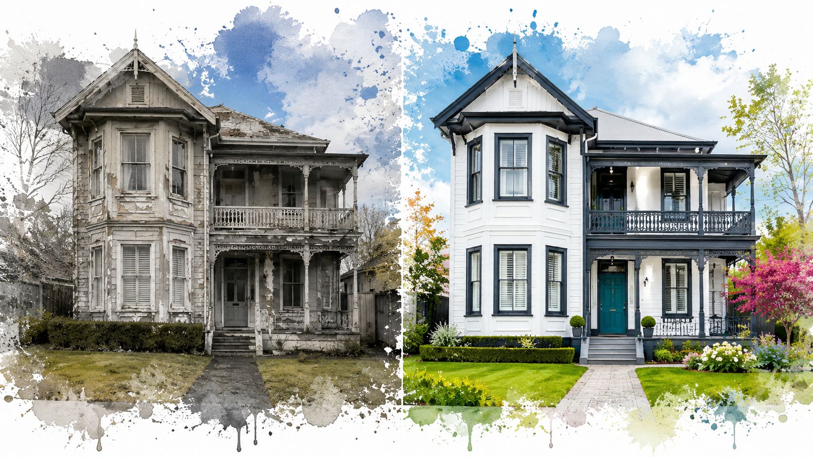
A heritage-style property benefits from restraint. Where old coatings have faded unevenly, the first task is to separate colour failure from substrate failure. Cleaning, scraping, sanding, timber repairs and spot priming create the foundation, then a heritage-appropriate body colour with a contrasting but related trim restores the verandah and window detail. The result feels more intentional because the palette follows the building's proportions rather than masking them with a fashionable dark block.
A mid-century weatherboard usually needs a clearer visual hierarchy. A warm neutral body can calm mismatched previous repairs, while a stronger door or selected soffit colour gives the elevation a focal point. The preparation work still carries the transformation: salt and grime removal, feathering of peeling edges, repairs to exposed timber and a compatible primer prevent the new scheme from highlighting old defects.
For a contemporary build, the better solution may involve reducing the amount of dark colour rather than abandoning it altogether. A lighter, heat-reflective tone across an exposed wall can reduce solar loading, with the darker shade retained on sheltered recesses or smaller elements. Building.govt.nz's guidance on higher-temperature-resilient homes supports considering lighter surfaces or solar-reflective paint where heat gain is a concern.
The video below offers another visual reference for how exterior restoration can change the reading of a home. It should be treated as inspiration, not as a substitute for assessing the actual North Shore substrate and exposure.
The useful lesson from these transformations is that colour consultation and preparation work together. A new palette cannot correct failed timber, trapped moisture or unsound previous coatings, and preparation alone cannot rescue a colour that places unnecessary stress on an exposed facade.
Your Exterior Colour Decision Checklist
Before approving a colour schedule, walk around the property as if you were inspecting a job rather than browsing a design catalogue. Check each elevation separately, because one house can contain sheltered, shaded, salt-exposed and highly reflective surfaces.
Site and planning checks
- Record orientation: Note which walls face north and west, and identify elevations receiving direct afternoon sun.
- Assess exposure: Consider clifftop wind, salt spray, open sections and sheltered garden conditions.
- Identify the substrate: Confirm whether each surface is weatherboard, cedar, brick, fibre-cement, stucco or metal.
- Inspect existing coatings: Look for chalking, peeling, cracking, staining, soft timber and failed sealant.
- Check local controls: Confirm whether heritage considerations, body corporate rules or other property restrictions affect the palette.
Colour checks
- Ask for LRV and TSR information: Treat very dark colours as higher-risk choices on exposed walls, and consider heat-reflective formulations where suitable.
- Test on multiple sides: View large samples in changing daylight against the roof, joinery, paving and planting.
- Set the proportion: Establish the dominant body colour first, then assign trim and accent colours with the house's massing in mind.
- Respect the material: A timber stain, acrylic wall coating and metal finish won't produce the same visual or maintenance result.
Coating and maintenance checks
- Match the primer: Use a primer or sealer suited to the substrate and the condition of the existing coating.
- Specify the topcoat: Confirm UV resistance, colour suitability and compatibility with the selected primer.
- Choose sheen carefully: A lower sheen can soften visual glare and reduce emphasis on minor texture, but it can't hide poor preparation.
- Plan access and timing: Allow for controlled washing, drying, repairs and suitable application conditions.
- Set expectations: Ask how the chosen colour and exposure are likely to affect future maintenance, rather than assuming every facade will weather equally.
A colour consultation should end with a written system, not just a colour name.
Painters North Shore provides exterior assessments, colour consultation, substrate preparation and Resene or Dulux coating options for North Shore homes. If your house sits in a coastal or high-sun position, visit Painters North Shore to arrange a site discussion before committing to the palette.


